
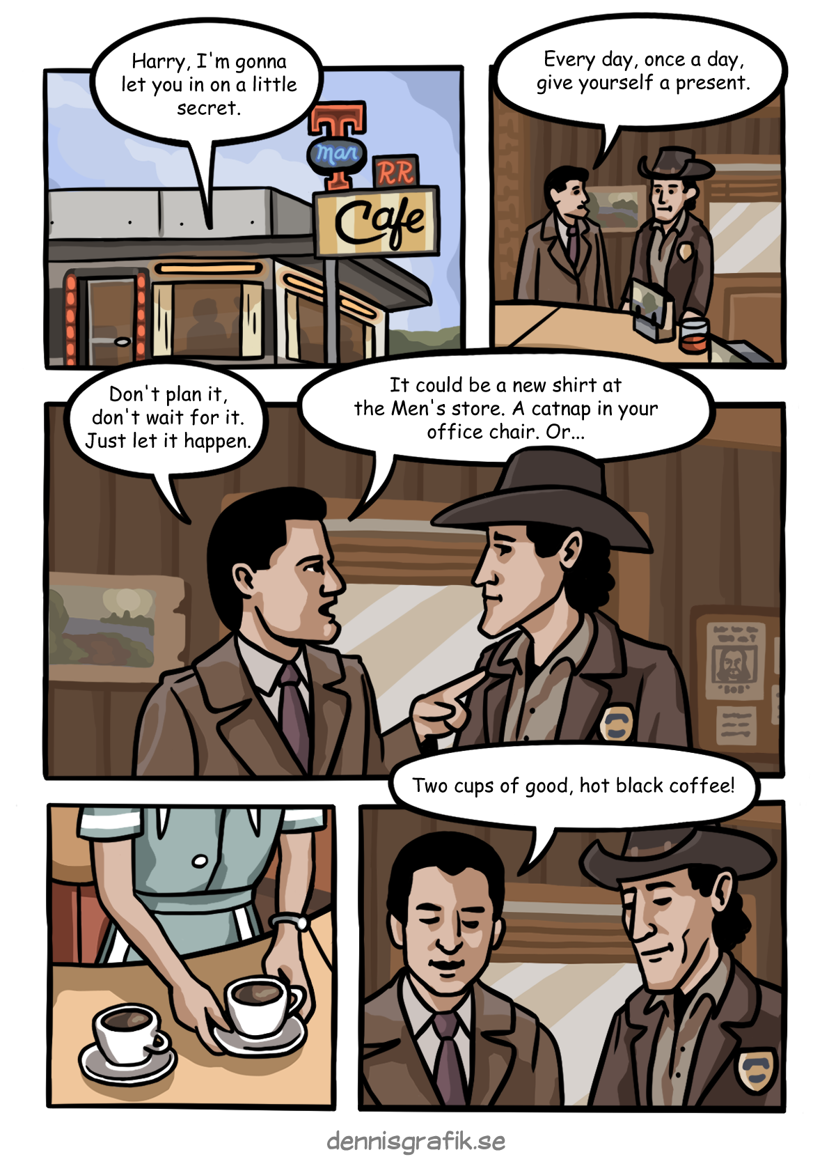
There is so much to love about Twin Peaks. After watching the full series and the movie in late 2023 I would honestly say that it changed how I view art, which I don’t think I could say about anything else. For this reason, it is almost a bit embarassing to admit that part of why I feel so connected to Twin Peaks, I think, is because I share a deep love of coffee with the show’s creators Mark Frost and David Lynch.
For comics, it’s always a good idea to start with panelling, sort of figuring out the layout of where everything is going to be on the page.
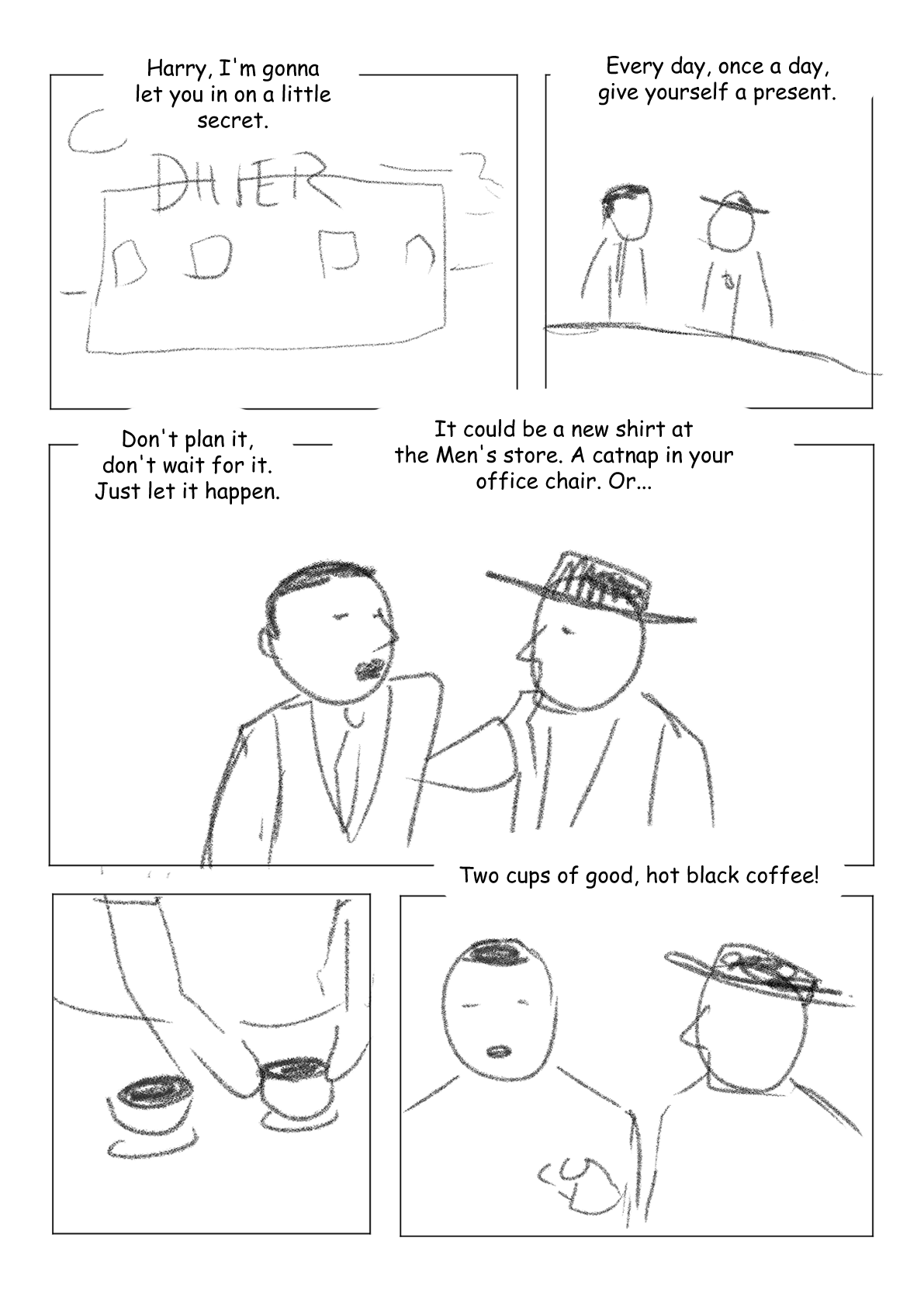
As you can see, absolutely nothing fancy, but going super simple let’s me experiment and find out which layout works best. Originally the middle section was split into two panels just like the top and bottom, but it felt too samey. I also experimented with merging the two speech bubbles into one, but it never felt right.
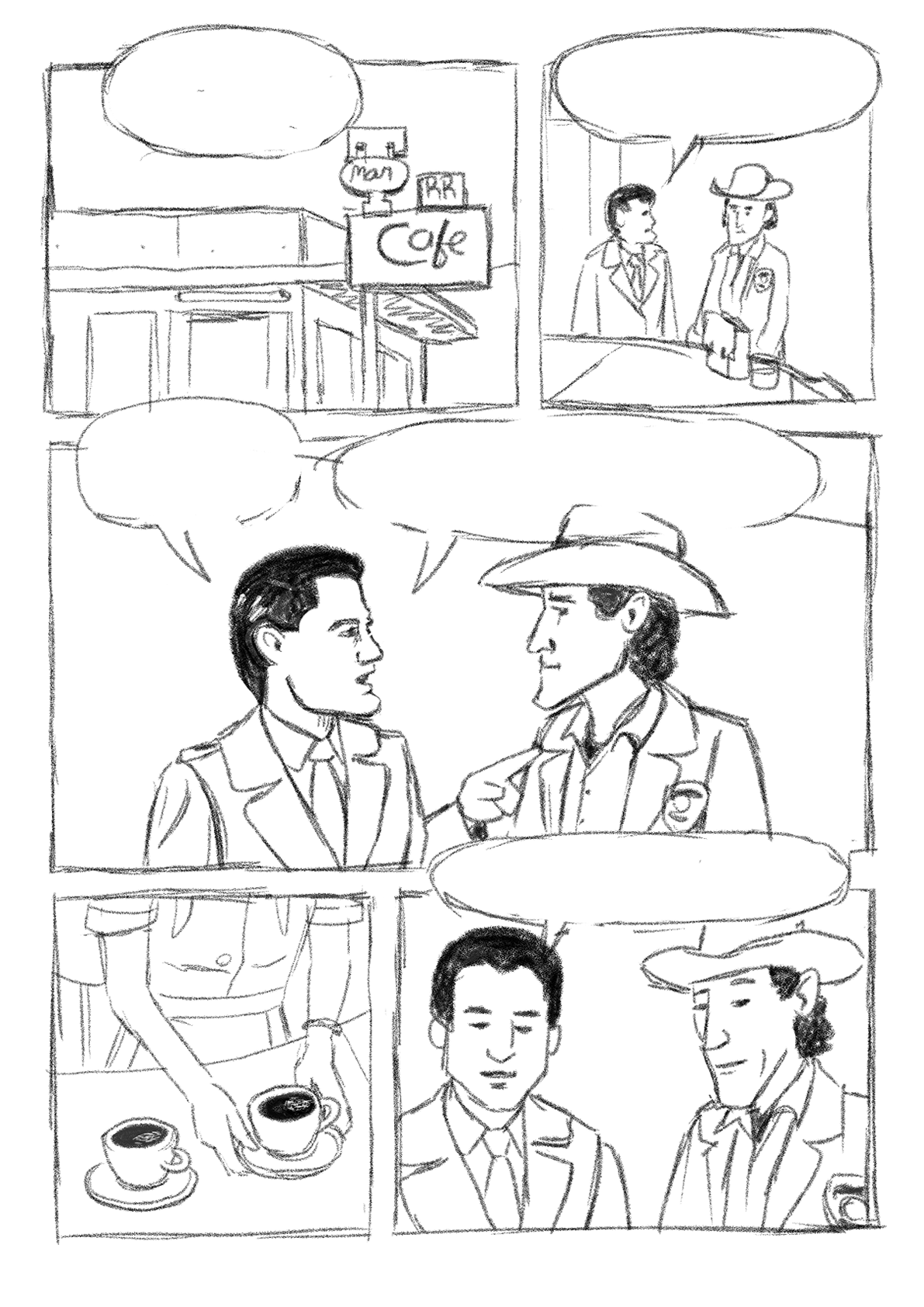
After panelling comes the sketch. Here I start using reference images from the actual show to make sure things look at least similar to the original. Sketching is my favourite part as this is where the foundation is laid for what the image will actually look like in the end.
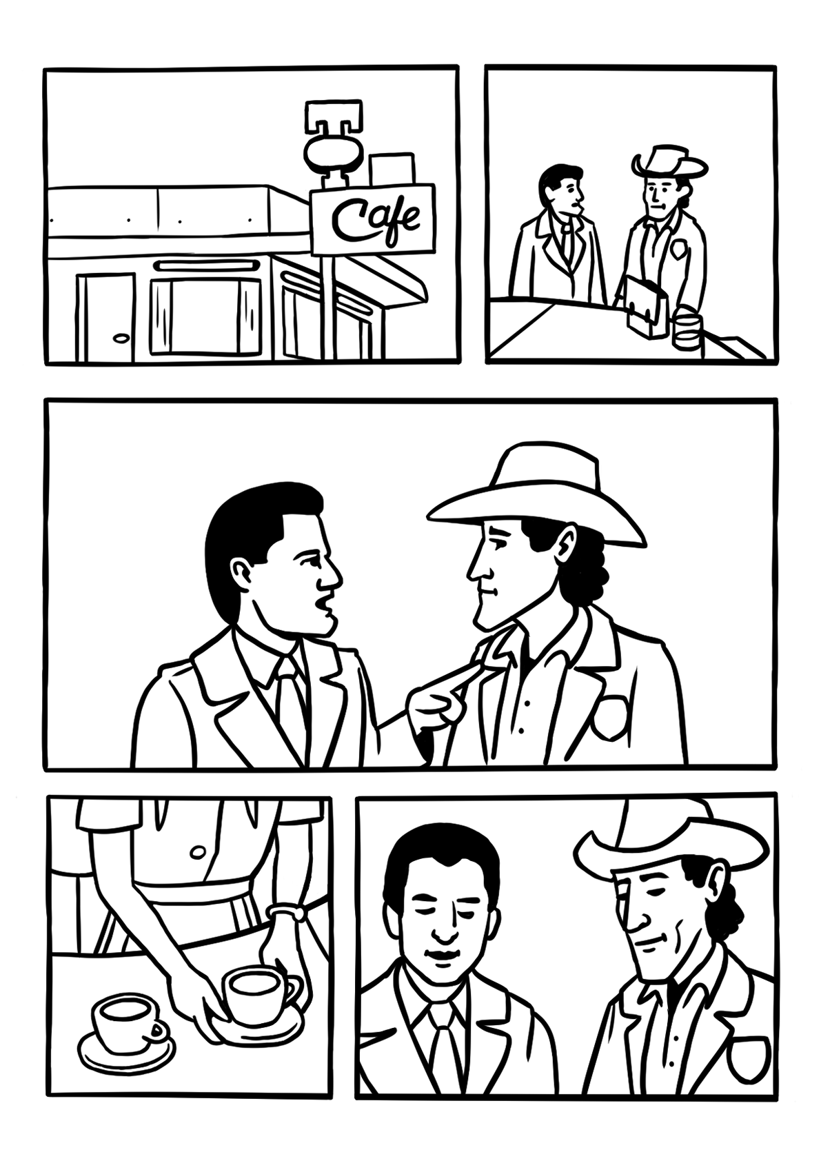
Reversely, doing the clean lines is my least favourite part of the process. To some extent it’s relaxing not to have to think so much about what I’m doing, but this is also the step that requires the least amount of creativity. It’s just drawing nicer lines over the sketch.
Some small changes and additions usually occur here however as I notice things I’ve missed. For example: I added in lights above all windows on the first panel instead of just the one. I also realized that Shelly was wearing a wristwatch, not a bracelet in the panel with the coffee.
Some details from the sketch are left out to later be added in again during the colouring phase, like the creases on Cooper’s coat and the details on Truman’s badge.
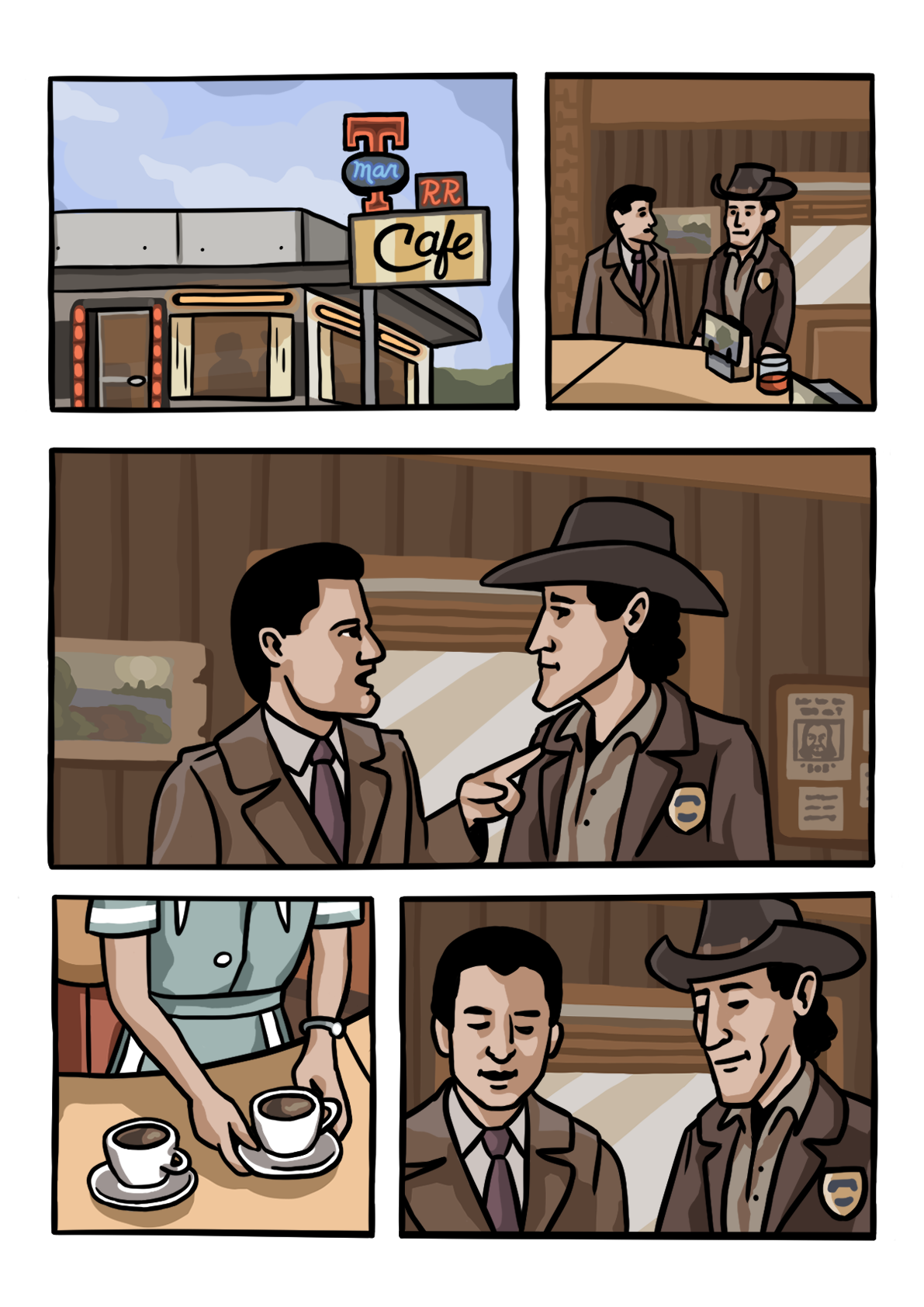
Colouring takes the longest. I tend to spend more time colouring than every other step combined. This is because I usually elect to draw all the background elements at the same time, as sketching these feels too cluttered for me. Stuff like the wood panelling, the windows, the painting are all done in colour straight away with no sketch, just using frames from the show as reference.
There’s a lot of simplifying here, making sure nothing in the background grabs more attention than the characters in the foreground. Originally I wanted to include a little Easter egg in the form of two characters from Mulholland Drive (another project by David Lynch) being seen through one of the diner windows in the first panel. I realized quite quickly however that making detailed characters in the windows would make everything very cluttered and potentially also make it a bit unclear who is speaking.
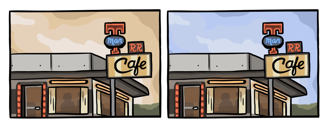
Speaking of the first panel, I did go back and forth on which colour to use for the sky. In the reference image I used it was clearly blue, but I thought it might feel more coherent with the rest of the panels if it stayed in that distinct, Twin Peaks-y orange. When looking at the comic as a whole I made the decision later on to keep the blue as that little bit of extra colour made everything a bit more pleasant to look at.
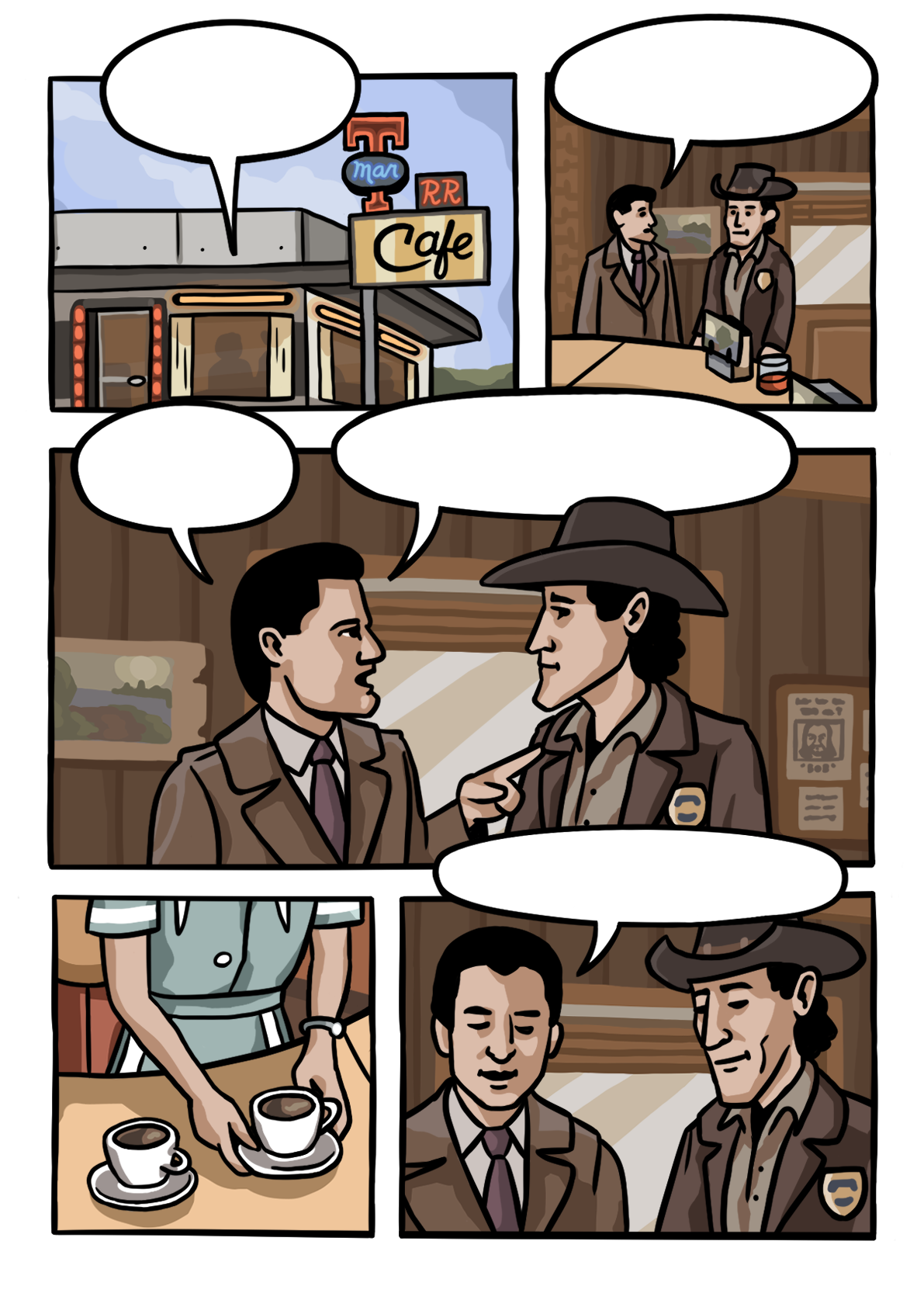
Adding in the speech bubbles is easy, as long as you’ve factored them in during the initial panelling and sketching. I decided to have them popping out of the panels a bit just to give more space to the art. During the sketch phase I had drawn Harry’s hat inside of the speech bubble on the middle panel just for my own sake to sort of remember the scale, intending to cover it up by the bubble, but in the end I thought it would be a fun little detail to have it on top of the bubble.
Final thoughts, I’m quite happy with the finished product. It is close to what I imagined when I started the project and the exterior shot ended up better than I thought it would. I think maybe a slightly thinner brush could’ve been used for the outlines and I’m also not 100% happy with the speech bubble layout in the end. I wish I could’ve snuck more Easter eggs into this one as well but then again I’m also happy that I was able to prioritize readability over a small detail.
I’ve been wanting to do something Twin Peaks related for a long time and I feel like I was able to capture the colour palette of the show fairly well. I also realized while writing this that I’m not used to writing about my own work, but it is something I feel gets more important day by day.